Maybe Volkswagen read my little typography rant published to Instagram after my Autostadt visit back in April (see below). Maybe they didn’t, but what they have done is launch two new fonts to take the brand into the future.
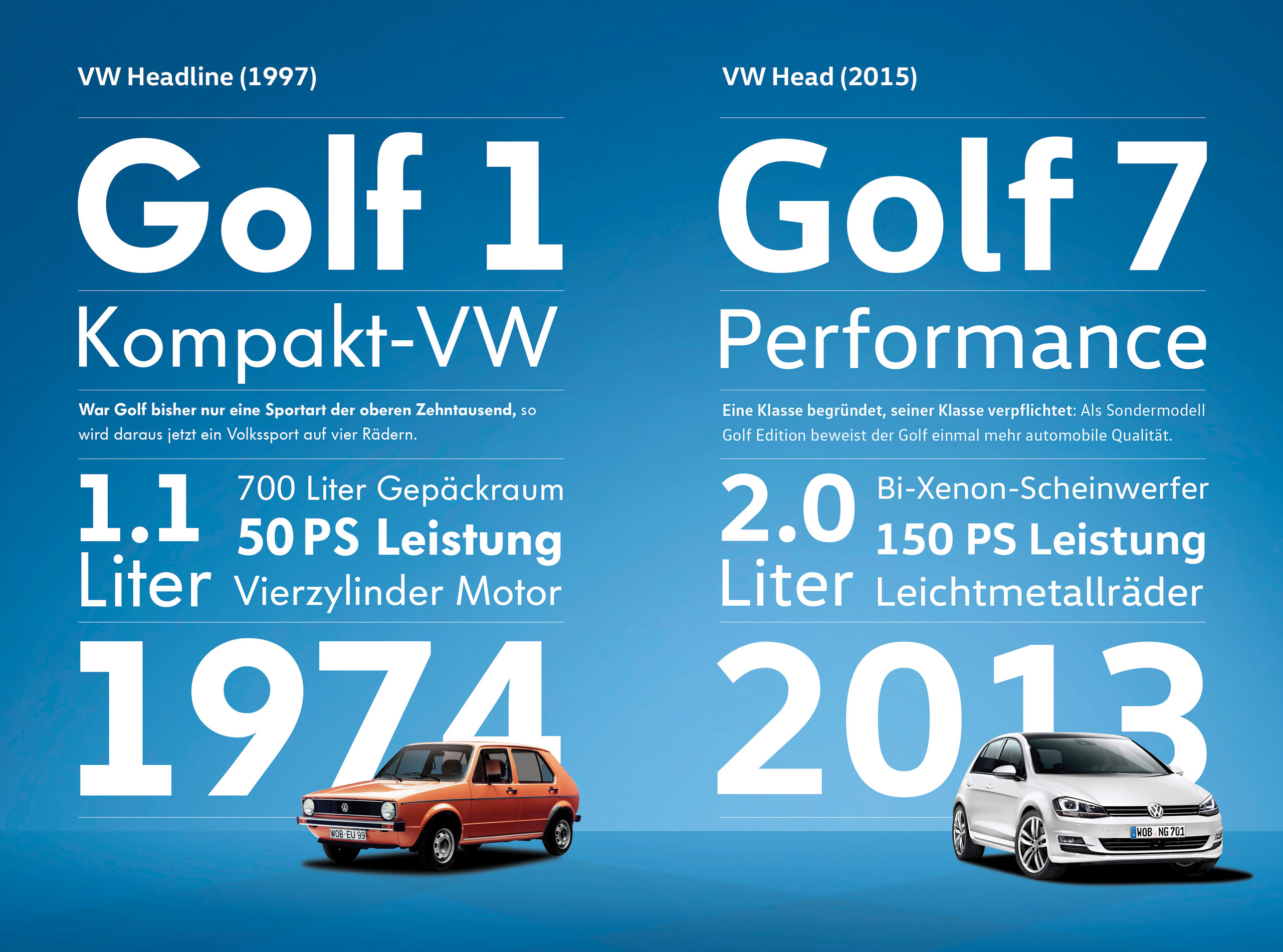
Gone is the still very functional and successful VW Headline and VW Utopia fonts, in use since 1997, and in comes the new VW Head and VW Text fonts.
MetaDesign has been working with Volkswagen since 1994 and launched the old fonts back in the late 1990s and is also responsible for the new designs, which radiate “dynamism, modernity, and the human touch”.
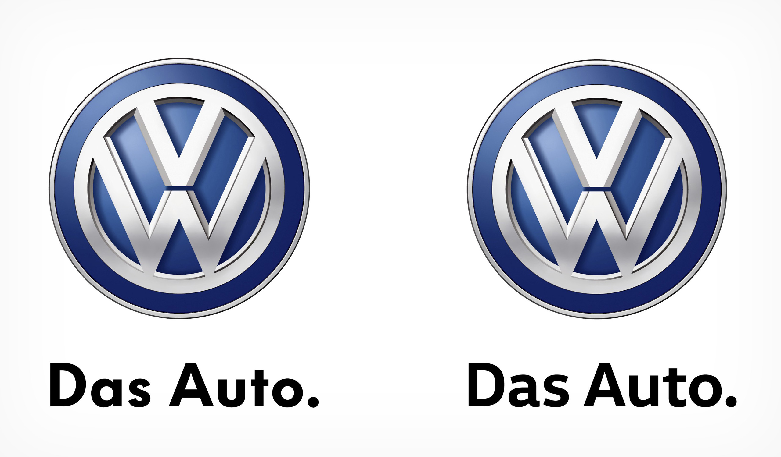
You can compare the two above and below, with the old style on the left and the new world order displayed on the right.
What do you think? Do you even care? I certainly do and if it means that shitty “Auto” text on the light switch will be gone then I will be very pleased!
[Source: Car and Driver & MetaDesign | Thanks to Wayne for the tip]
MetaDesign and Volkswagen give the Volkswagen brand a new signature
2015-05-27
MetaDesign, Germany’s leading brand agency, has taken the Volkswagen brand typeface to a new level. Beginning 25 May 2015, the carmaker will communicate in a new visual dialect around the world and across all media. The brand typeface, developed exclusively for Volkswagen, will be used in all communication media and in all vehicles, thus contributing to the high recognition of the brand. It will be rolled out successively according to production cycles.
Ongoing digitalization and globalization place new demands on a holistically integrated brand image. The increasingly digital cockpit design means that brand elements such as the typeface are becoming more prominent inside the vehicle, for example in the instruments and infotainment systems. And as the Volkswagen brand has continued to develop over the years, its look has always grown with it. As a key component of the brand’s look and feel, the typeface has now been reworked and updated. The use of a proprietary typeface also contributes to cost-efficiency, allowing the company to avoid license payments for unlimited user rights.
The exclusive typeface was developed in collaboration with the typographer Hannes von Döhren in two distinctions, “Volkswagen Head†and “Volkswagen Textâ€.
The typeface family radiates dynamism, modernity, and the human touch, and thus creates an optimal brand fit between the look of the type and the character of the brand. As in the distinctive Volkswagen vehicle design, form and function harmonize to create a unified whole. Angles, edges, and curves create visual bridges and a pleasant flow. With regard to modern technical standards and criteria such as space, legibility, multi-lingualism, and cross-media practicability, this typeface is perfectly suited to use in digital and mobile media.
“Having a typeface that we can use in both our communication and our products is a new quality for Volkswagen. This typeface is obviously inspired by our vehicle design, communicates the character of our brand and offers Volkswagen customers a distinct and sustainable brand experience,†says Xavier Chardon, head of marketing at Volkswagen Brand Cars.
Arne Brekenfeld, CEO of MetaDesign, adds: “Our globally networked digital world places a host of new demands on branding in general and on a brand typeface in particular. We’re delighted to take this visible step into the future of branding together with Volkswagen, our customer of many years.â€
MetaDesign and Volkswagen look back on a long and successful partnership that started in 1994. The Berlin-based brand agency also created the carmaker’s outgoing typefaces, VW Headline and VW Utopia, both in use since 1997.
5 replies on “Volkswagen launches new corporate fonts”
aaaand you just ruined my headight switch for me hahaha. i’ve never noticed that before.
I just knew you would be all over this one!
I’ve never even noticed this until April this year lol.
VW should focus less on fonts, and more on building cars that don’t repeatedly break down! 😛
Yet another reason why the MK4 is the best Golf, Liam 😉