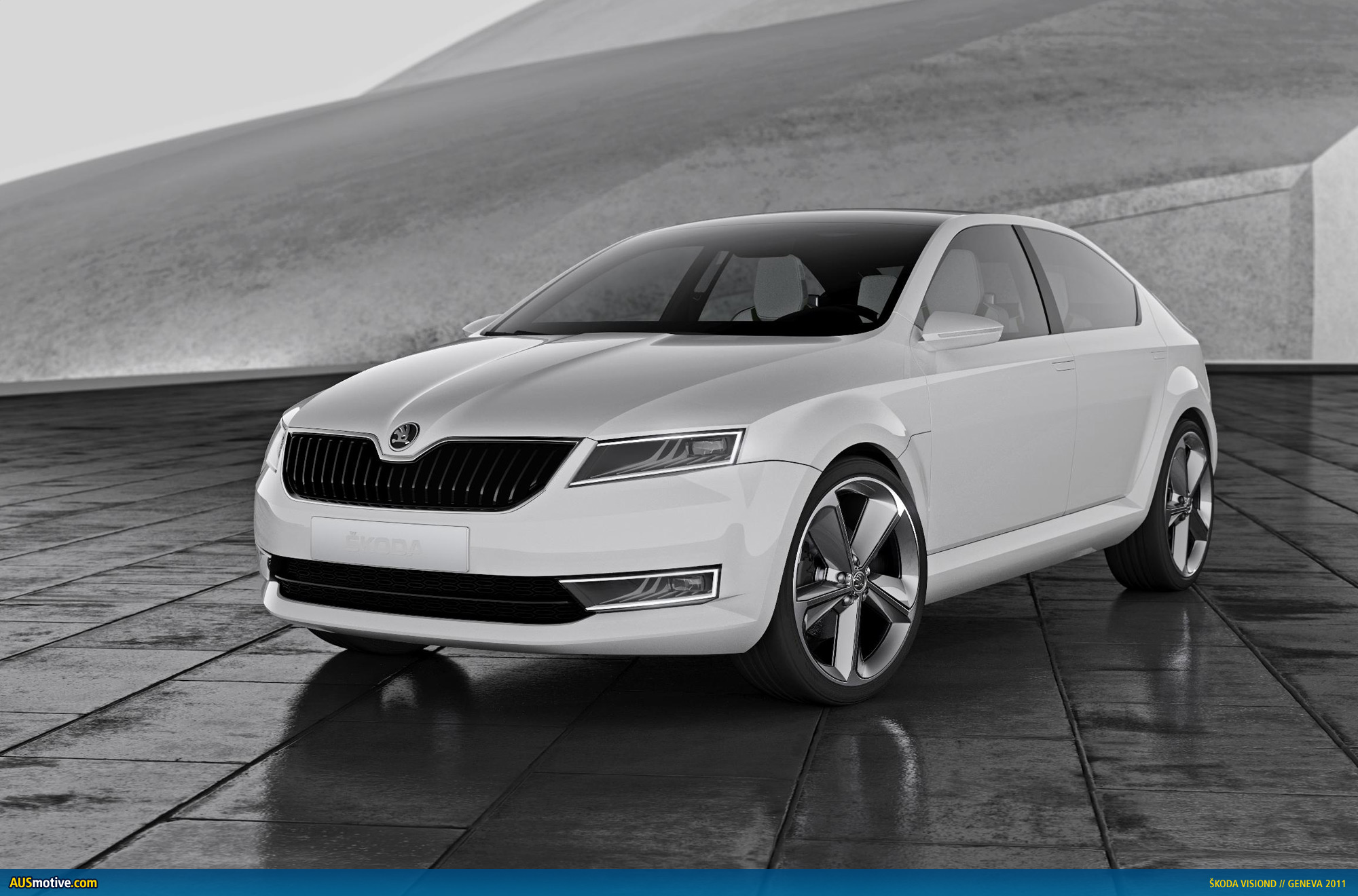
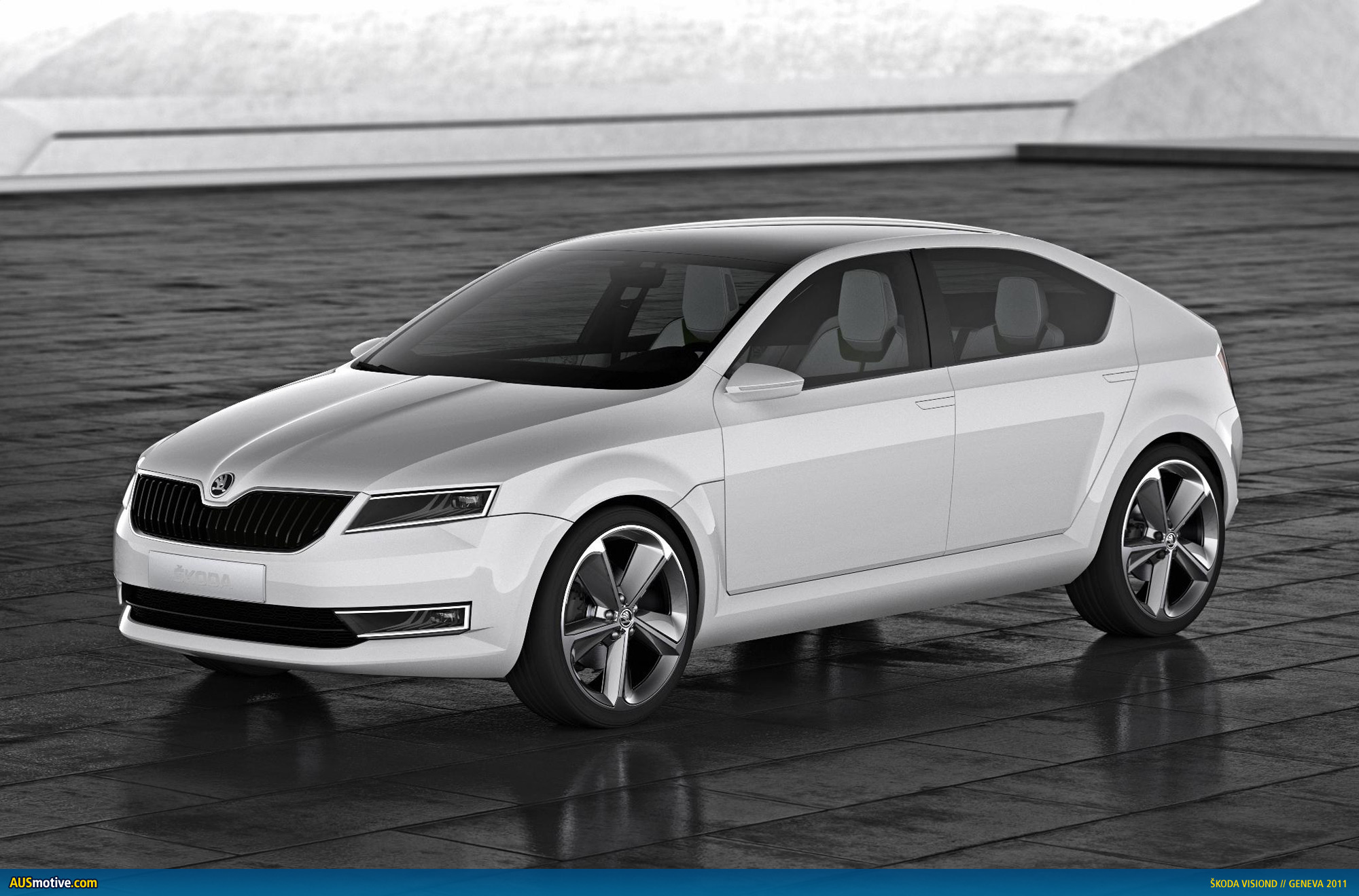
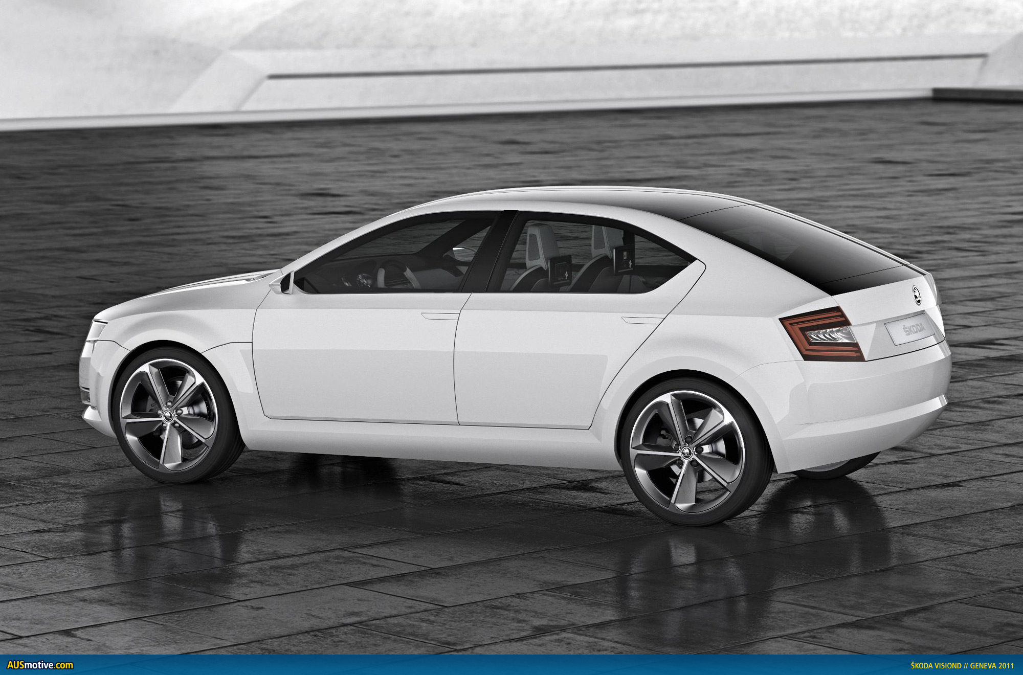
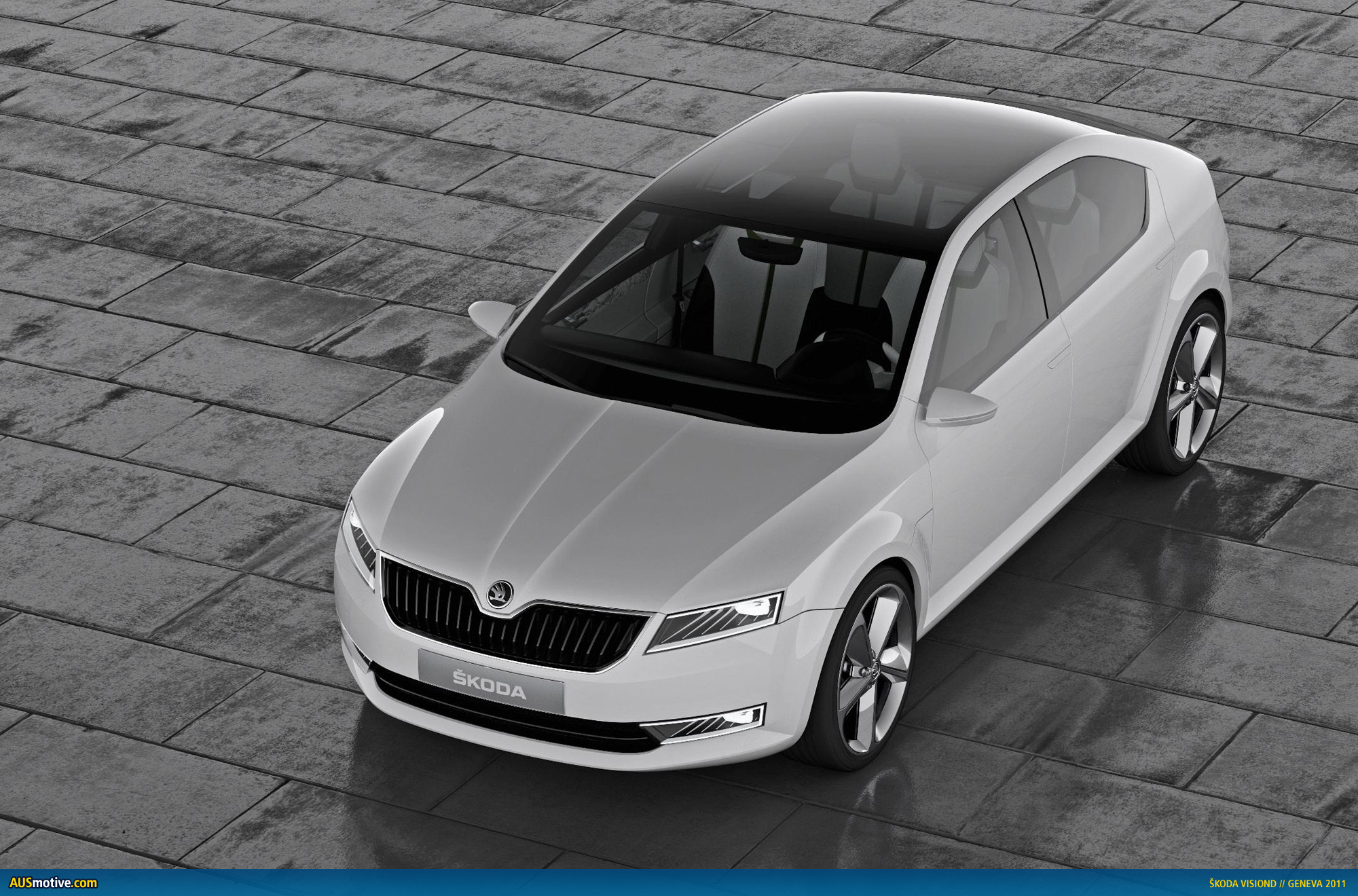
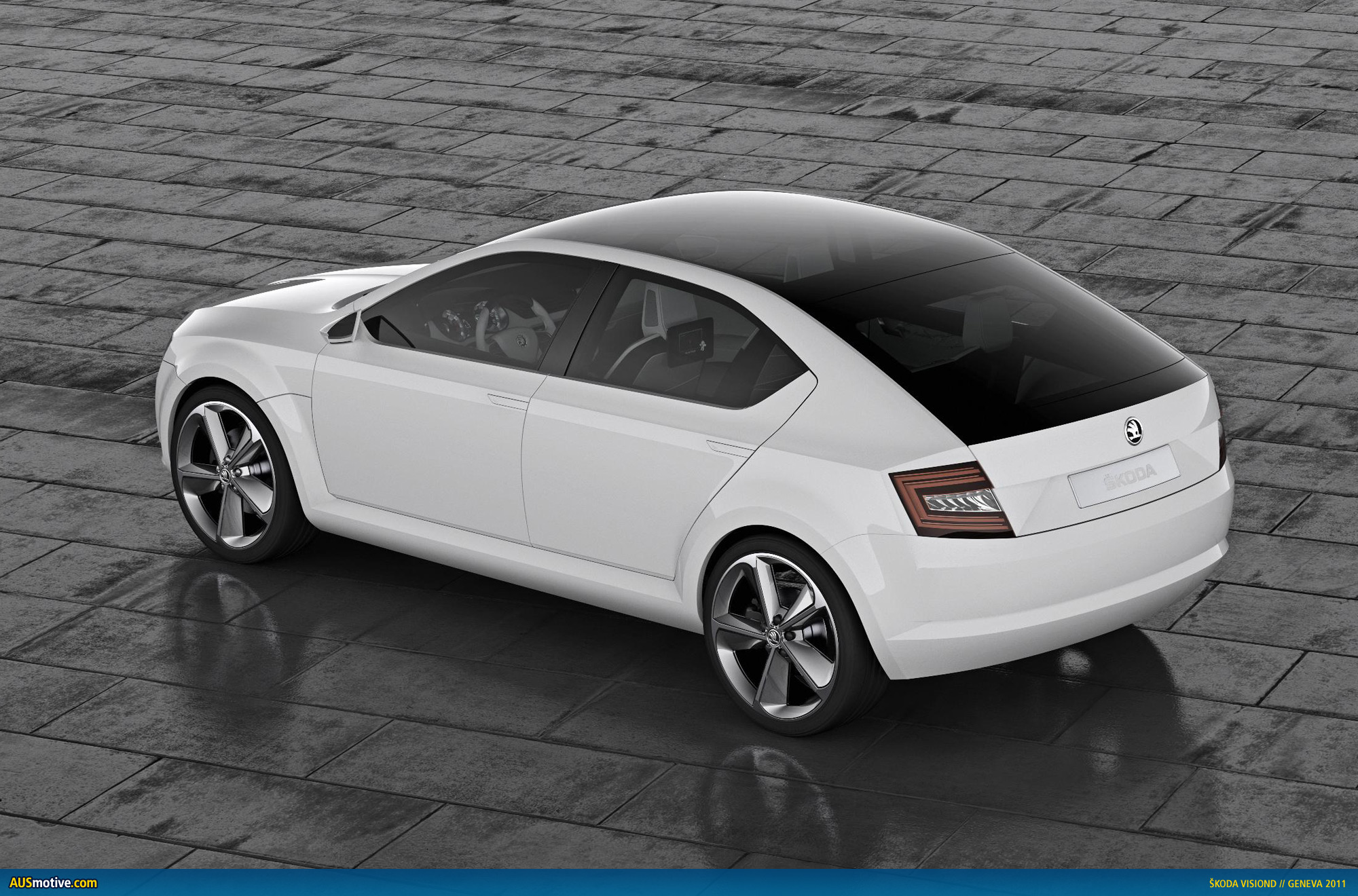
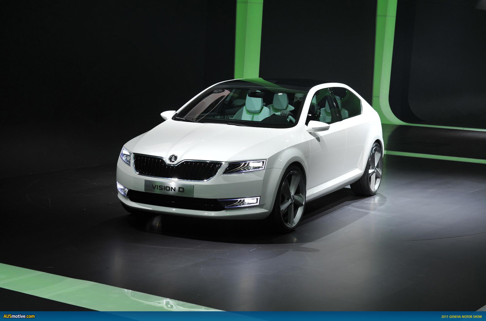
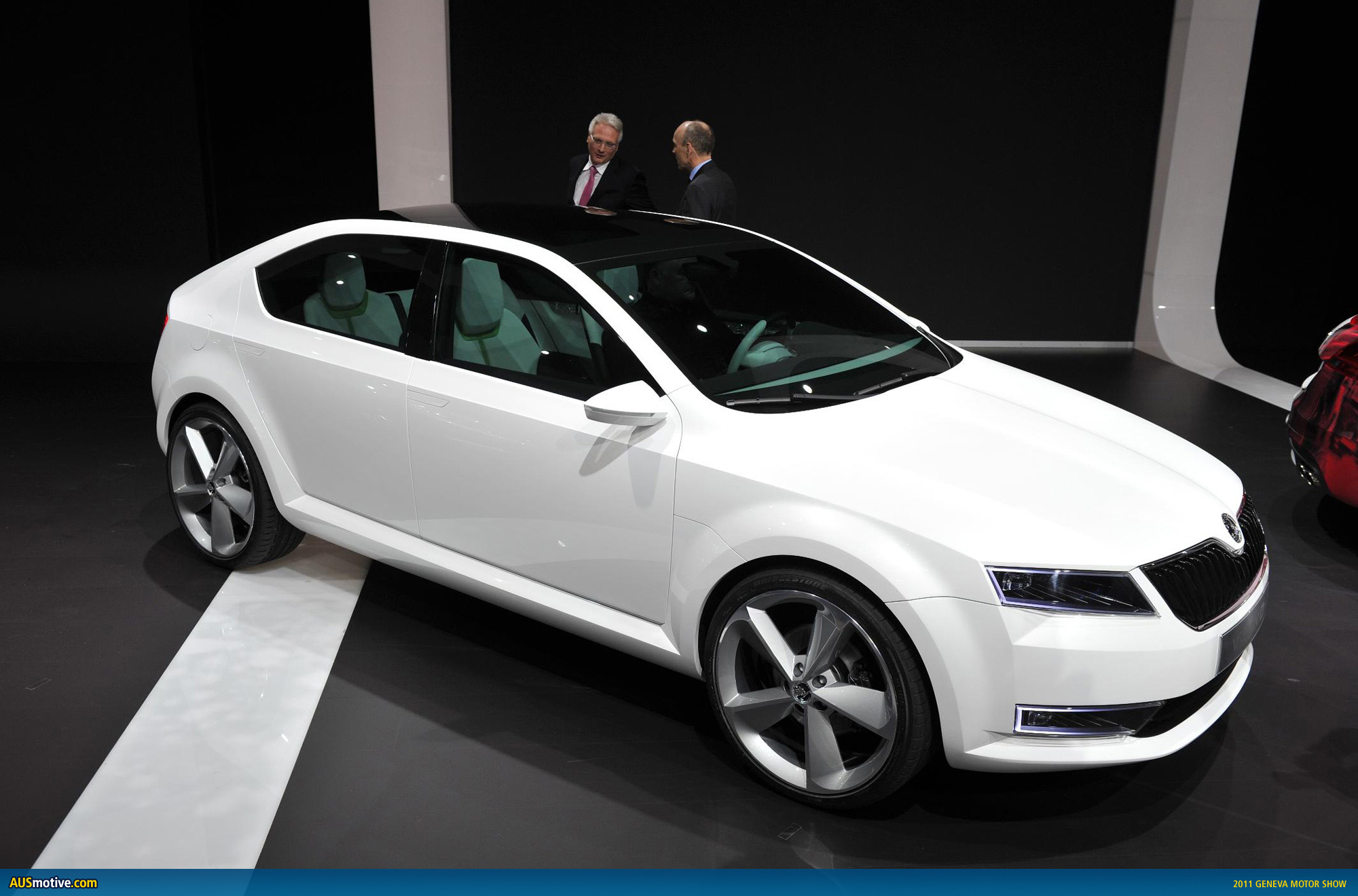
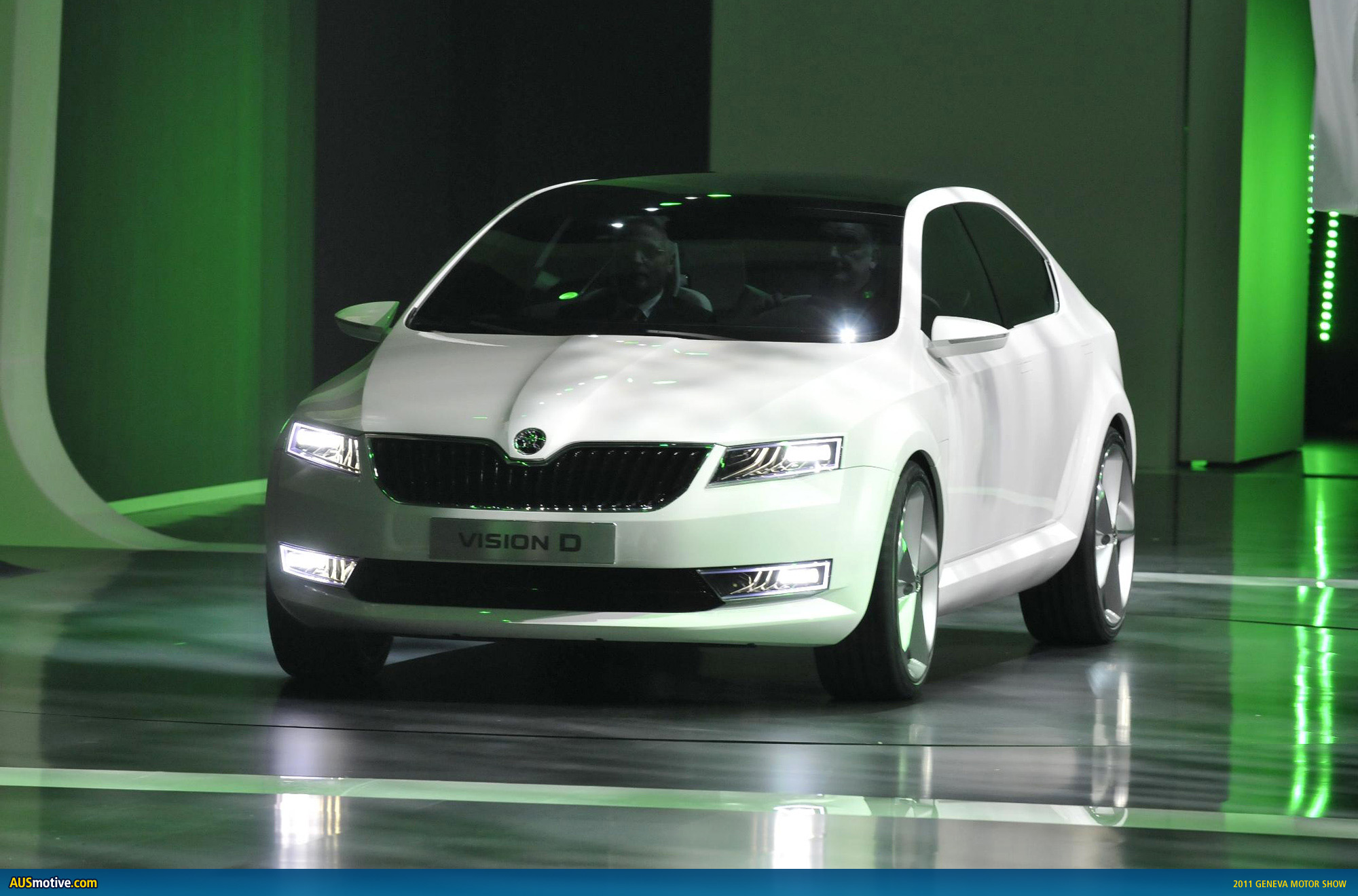
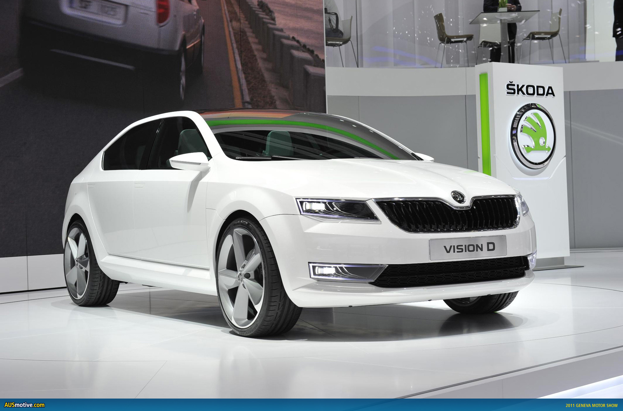
Å koda has gone the extra mile at Geneva by unveiling a new logo as well as a new concept model. The concept, called the VisionD, reveals the company’s design direction for future models. A long wheelbase and short overhangs are the order of the day, according to Å koda, as this will allow for better interior space.
The logo is accompanied by an updated slogan, as well: “The new power of Å koda”
Jürgen Stackmann, the Board Member responsible for marketing and sales, says, “We are keen to express the new power of our brand not only through our future products, but also in the way we present ourselves to partners and customers.
“Å koda is synonymous with attractive cars offering exceptional value for money, countless clever solutions and precisely executed work. All this is clearly reflected by our updated corporate design.”
When you consider the gravity of these announcements the whole affair seems incredibly low key. The concept pics present a nice enough car, but maybe there could have been some more life in the official pics released. Take a look for yourself and see what you think.
![]()
![]()
Å koda Auto has presented a design concept and its new corproate design
- “VisionD“ – a design concept offering a glimpse into the future
- Å koda Auto’s new corporate design
Mladá Boleslav, 28 February, 2011 – Under the slogan “The New Power of Å kodaâ€, Å koda Auto presented its new corporate design at this year’s Volkswagen Group Evening. The event also saw a design concept called “VisionD“ that shows the brand’s new direction towards extending its model portfolio and intensifying its activity in Europe, as well as in China, India and Russia.
The manufacturer presented a very special facelift at the event: for the first time ever, Å koda is presenting the key elements of its new corporate design whose distinguishing features are freshness and precision. As its established characteristics evolve, Å koda has undergone visual rejuvenation to make it an outwardly even more valued brand.
“We are keen to express the new power of our brand not only through our future products, but also in the way we present ourselves to partners and customers. Å koda is synonymous with attractive cars offering exceptional value for money, countless clever solutions and precisely executed work. All this is clearly reflected by our updated corporate design. As it forges ahead, Å koda is eager to flex its newfound strength in the international arena,†stressed Jürgen Stackmann, the Board Member responsible for marketing and sales. “Škoda is steadily evolving and it shows. Our new design and fresh outlook reflect our plans for the future.â€
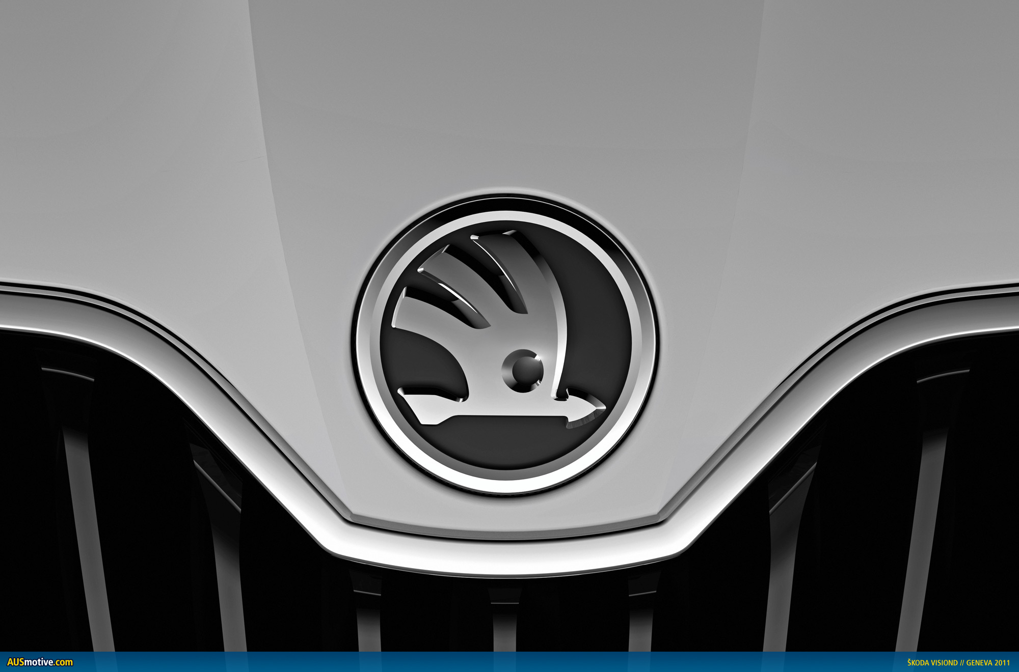
The most important change affects the main part of the logo, the winged arrow, which in the new design will be much larger and more visible. The hue of the winged arrow has been changed from “natural green†to the new lush “Škoda Greenâ€. The outer area is highlighted with a chrome look.
By unveiling a design concept called “VisionD“, Škoda is offering a glimpse into the future. The economic goals set by the carmaker require a new focus drawing on the inspiration of a tradition stretching back for more than 110 years. The use of modern stylistic elements and the latest technology is a logical step. The design concept fleshes out the contours of the growth strategy with clearly defined features, maximum care and attention to detail.
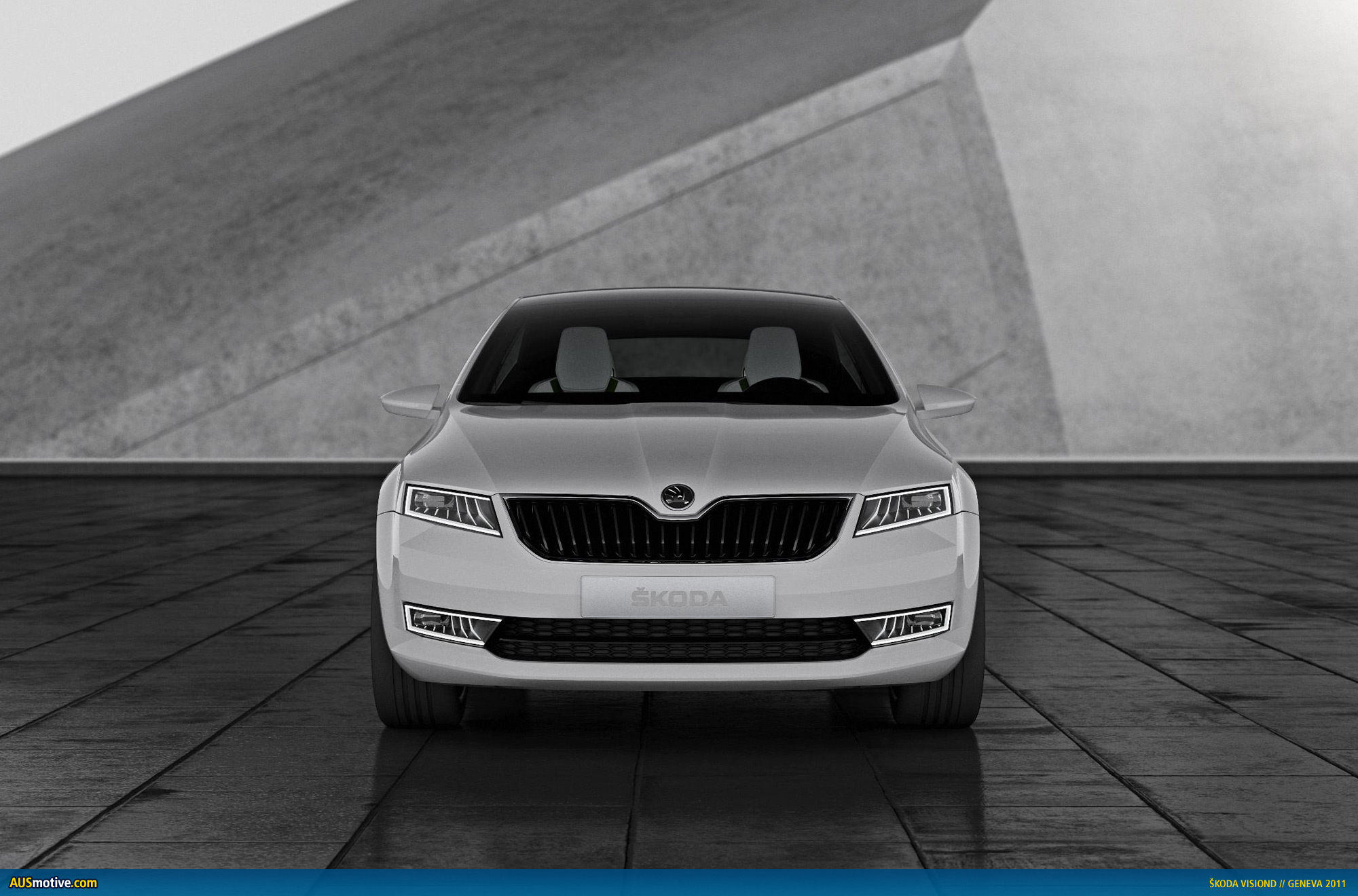
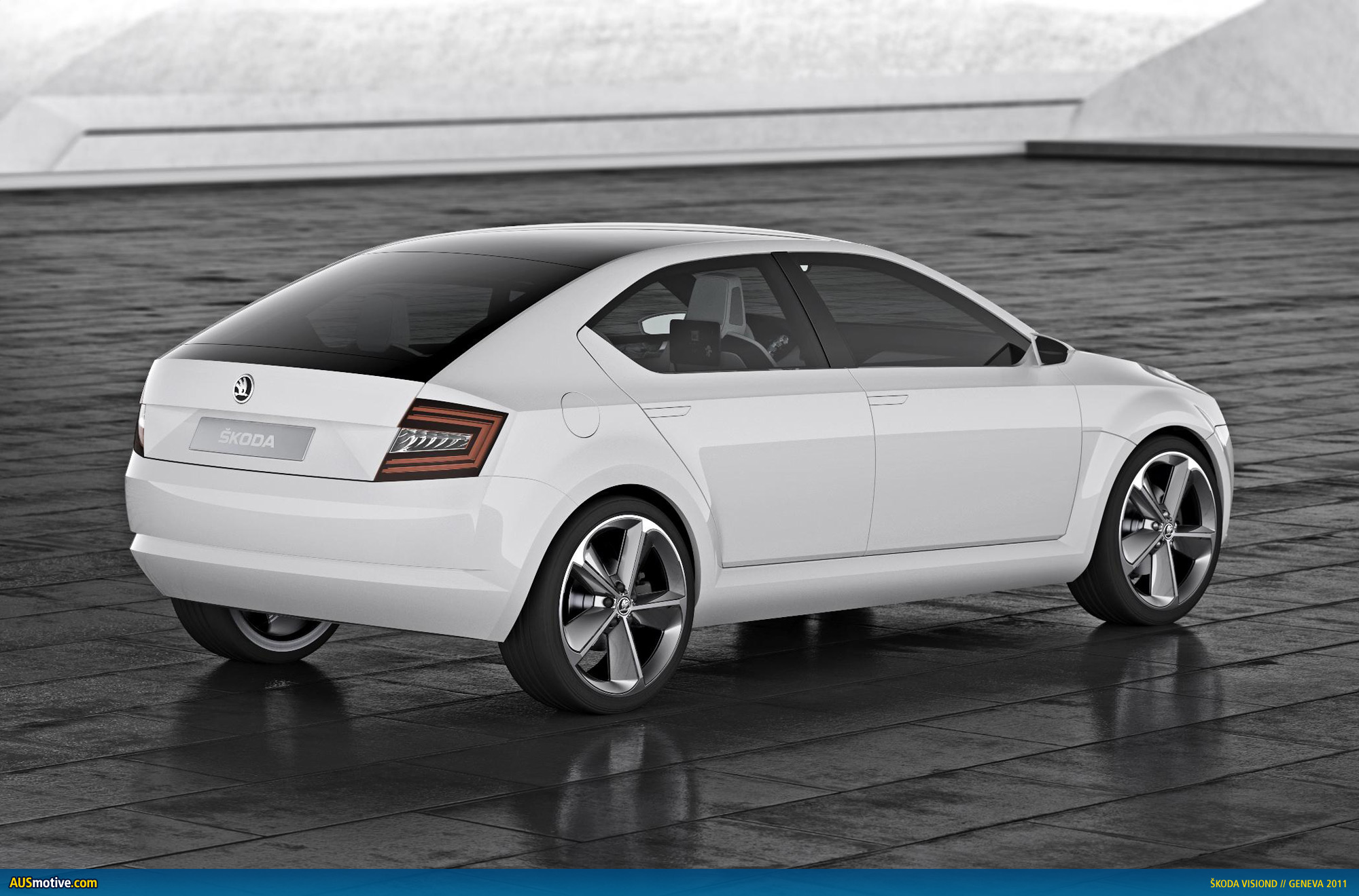
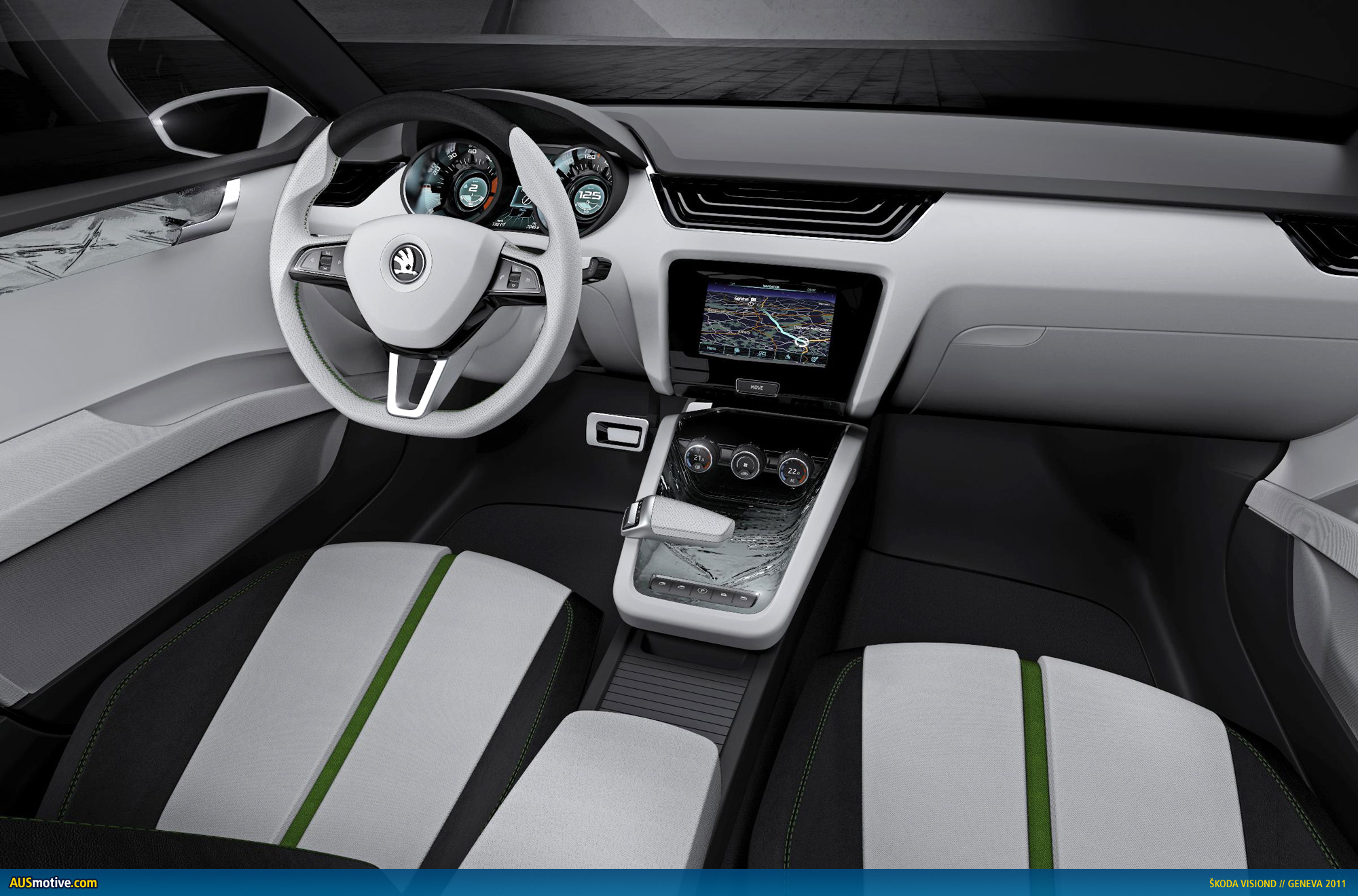
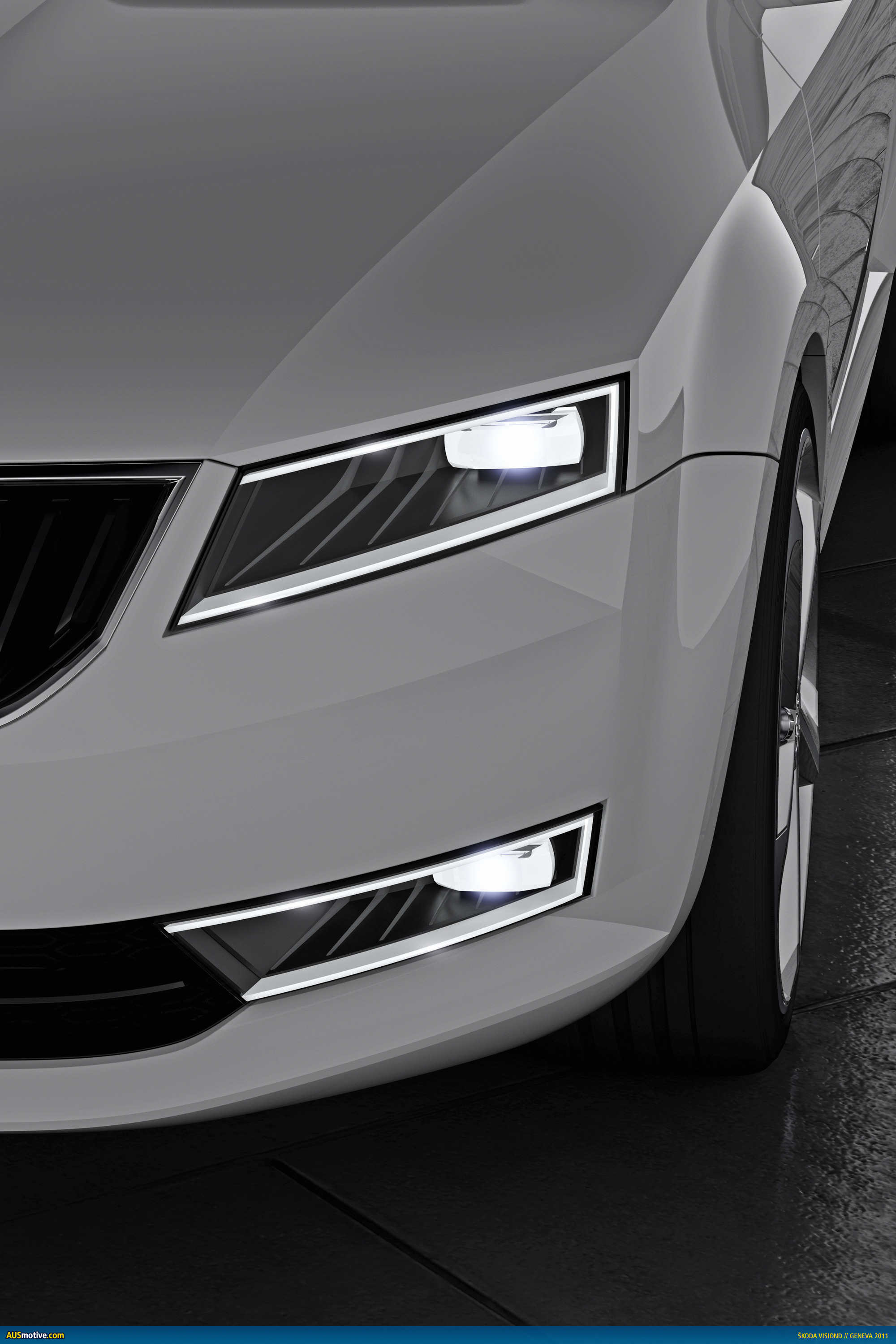
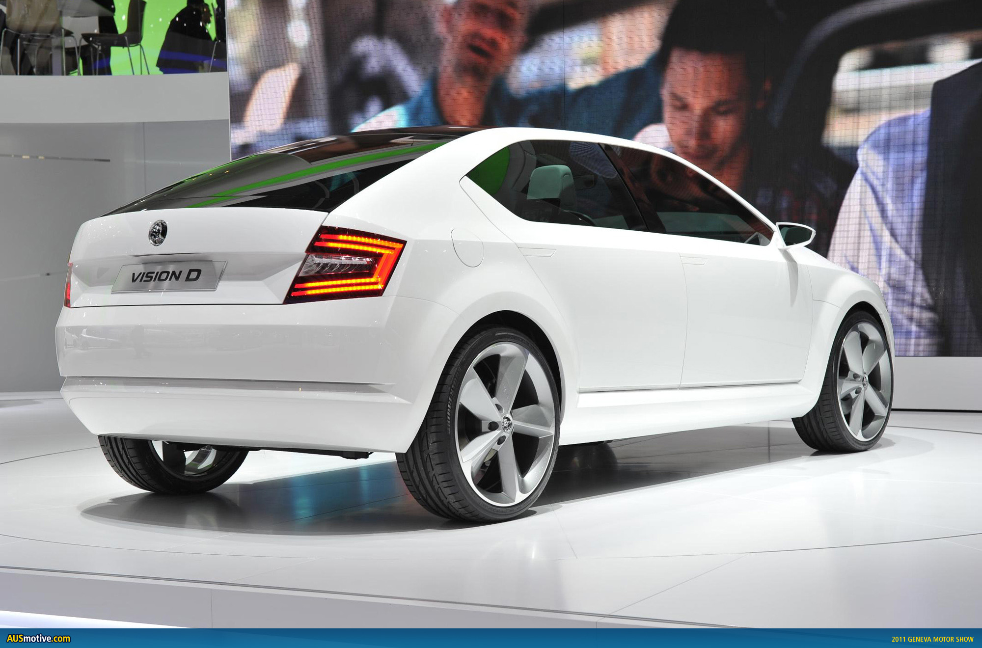
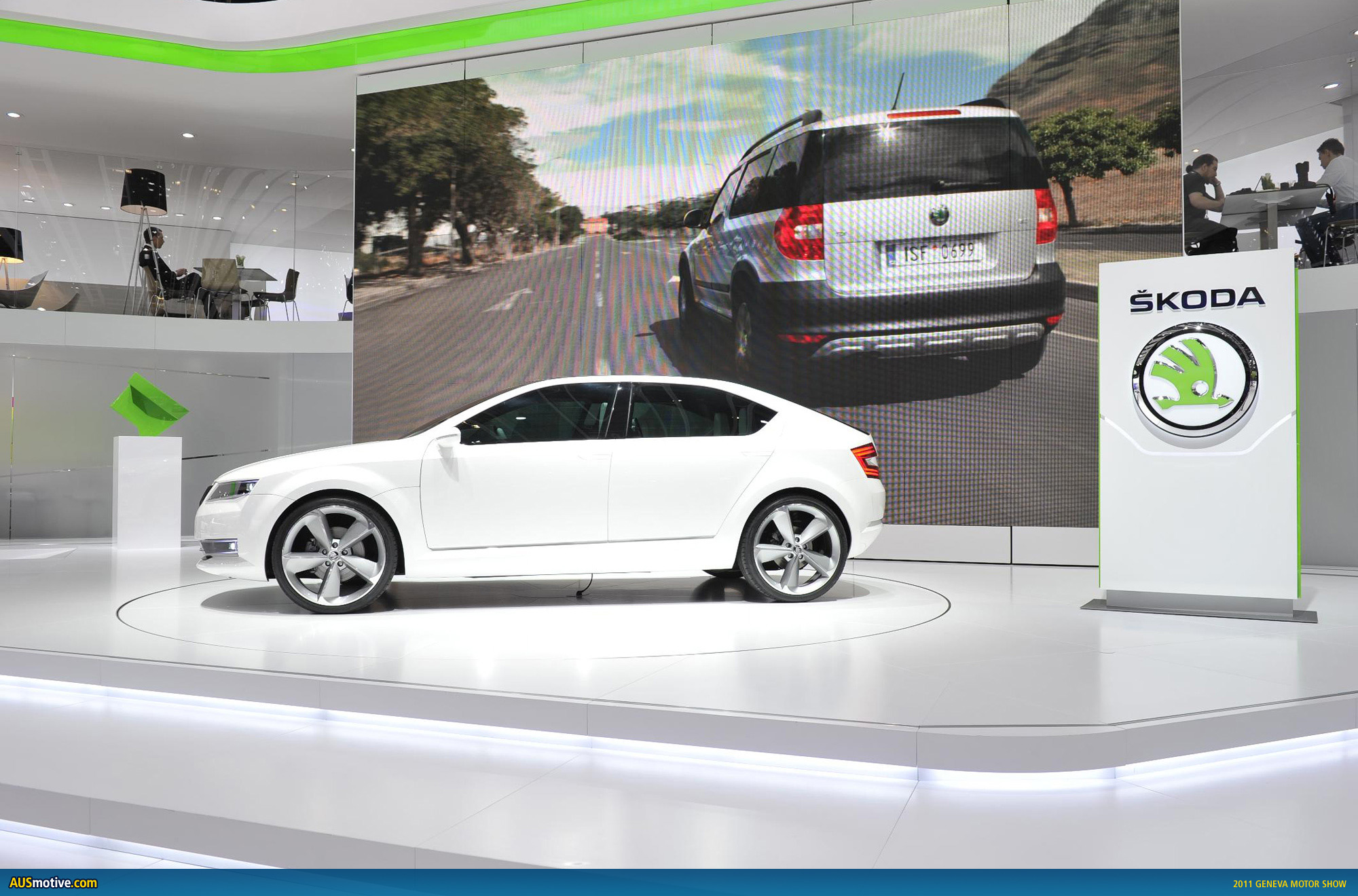
“VisionD“ singles out characteristic design elements of the Škoda brand and guides them towards the future. The long wheelbase and short overhangs are a prerequisite for successful automotive architecture as they both allow for above-average interior space and, coupled with the dynamic roof line, lend the car a high degree of visual majesty.The fluent integration of the tailgate underscores the entire car’s sophisticated practicality. The high everyday utility value and distinctive interior modular design are traditional brand values which are freshly interpreted in a more modern form here. The radiator grille with its unobtrusively shiny finish symbolizes the brand’s aesthetic blueprint, its fine slats resembling taut harp strings.
The newly arranged and clearly structured logo stands out in the middle of the car as the starting point for all the contours. It intersects the horizontal line of the bonnet, highlighting its special status as a symbol of quality and success.
The design concept marks another big step into the future for ŠKODA. Its forms shapes are dynamic, stimulating the imagination of observers without provoking them, and offering an undistorted view of the outlook for cars made in Mladá Boleslav.The designers and engineers have paved the way for future success. This traditional Czech brand is now best placed to achieve its ambitious goals: economic growth coupled with new design full of potential, while preserving established traditional strengths such as great performance, value and precision.
7 replies on “Geneva 2011: Å koda’s new logo and VisionD concept”
Nice logo and type face. Since when does Skoda do anything newer than a mild re-skin of a superceded VW or Audi ?
Yeah, agree the logo refresh is quite nice. Interesting that the “lush green” didn’t get a guernsey on the show car, though, aside from a very light splash on the seats.
Skoda’s run current VW model platforms, not superceded ones. Some of the styling may have been carried over from previous VW/Audi models, though.
Nice to see it has retained the central crease in the bonnet. They could probably modify the corporate face of the rear light cluster though.
car with a very elegant design, with white color gives the impression of a luxury car.
It looks a lot like new BMW models – especially the back… Still – they’ve changed the only objection I had in those cars – good for them.
[…] Å koda VisionD concept […]
[…] […]